The OBS logo design uses hand-rendered type to reflect the geometric and structured nature of a bicycle. The letterforms are joined by a border that crosses through the logo, creating the 'L,' reflecting the path a cyclist may take.
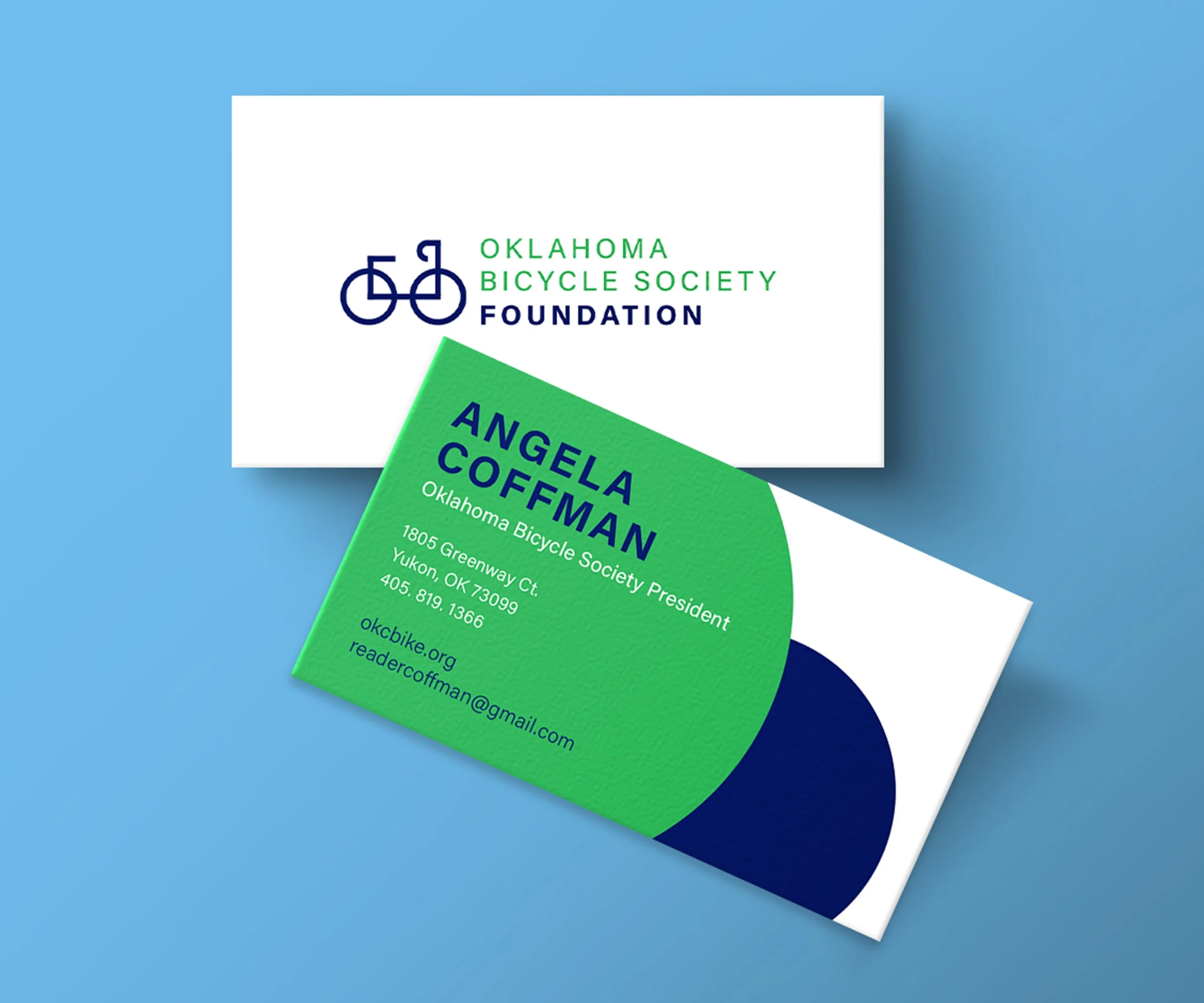
The OBS Foundation logo takes elements and characteristics of the primary logo to create the bicycle icon. This showcases the unity present within the cycling community. A vibrant blue and green are prominent in the branding to ensure visibility while biking.

oklahoma bicycle society